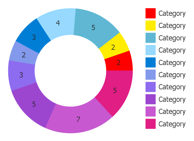
Last weekend I was looking for visualizations that could be useful in TilesFX and I stumbled upon some charts called either doughnut, ring our donut charts. Nothing really special but not available in the standard JavaFX charts. So here is an example of what I'm talking about...
So we have a visualization of values in percentage so the sum of all values is always 100%. And the nice thing about using this donut like visualization is that we can use the inner part of the donut for additional information (e.g. like the value of the sum etc.).
Because on a dashboard you would really like to focus on the important parts (means you don't want to show a donut chart with 20 sections but maybe with 3 or 4) I can keep the whole thing really simple.
Because of the space constraints the legend will only appear if the width of the chart is larger than 1.2 x the height.
For the visualization I've decided to show the value inside of each segment, the percentage close to each segment on the inside of the ring and the sum of all values in the center of the donut chart. So the result looks like this...
Like in the last chart that I've added (the RadialChart) I've again made use of the JavaFX Canvas node which is perfect for graphics like this. Also animating this chart is really easy because of the good performance of the Canvas node.
The source of this little DonutChart can be found on github as always, so feel free to fork it :)
And like with the RadialChart I've decided to add the DonutChart as a separate skin to the TilesFX library. Means since release 1.3.6 of TilesFX you are able to make use of it.
Here are also some screenshots of the DonutChart in TilesFX...


No comments:
Post a Comment