Another Friday and again time for some fun... :)
Last week someone pointed me to so called horizon charts which are a really nice way to visualize data in a compact way.
To give you an idea what they look like here is an example...
The idea behind it is to reduce the amount of space and preserve the information by splitting a graph in the vertical direction in so called bands.
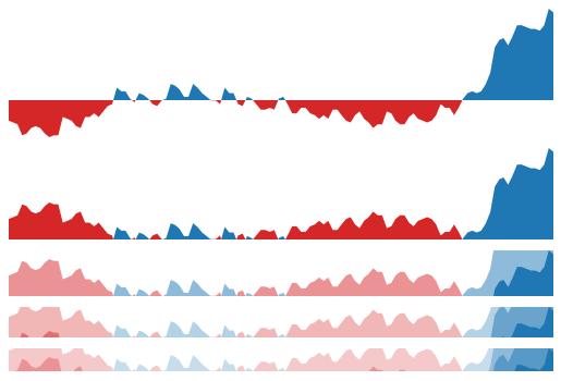
The following image will show how it works (it was taken from here)...
As you can see in the image above first you flip the negative values to the positive side by inverting them (2nd graph).
Now you split the vertical axis in bands and place all of them on the 0 value of the y-axis. The image above shows an example for 1 band, 2 bands, 3 bands and 4 bands.
For every band you change the color (usually from a lighter to a darker color). So you get some kind of a heat map where darker colors visualize higher values.
So my JavaFX implementation looks like follows for some random data...
For the implementation of this chart I used the JavaFX Canvas node again which should also work with lots of data because it will only use 1 node on the scene graph. So the HorizonChart will take 2 nodes on the scene graph, one for the Region and one for the Canvas.
At the moment you can split the graph in up to 5 bands which seems to be enough for most of the visualizations I've found.
To get nice colors for the chart I've also added some convenience methods in the Helper class to create color variations for a given color.
For example let's assume you would like to visualize positive values with shades of blue and negative values with shades of red and you will use 4 bands.
To create the colors simply use the following code...
List<Color> positiveColors = Helper.createColorVariationsAsList(Color.BLUE, 4);
List<Color> negativeColors = Helper.createColorVariationsAsList(Color.RED, 4);
Now you can set these colors on the chart instance as follows...
HorizonChart chart = new HorizonChart(4, series);
chart.setPositiveColors(positiveColors);
chart.setNegativeColors(negativeColors);
The HorizonChart doesn't come with any axis or bounds which should make it easy to implement it in your own more feature rich chart. Meaning to say the chart will always take the whole space you defined for it using the setPrefSize() method.
So you decide the size of the chart and the chart will scale it's content always to the defined area.
When using not so many data points you might want to smooth the chart which is possible by using the setSmoothed() method of the chart or by setting the smoothed value in the constructor (usually you don't need smoothing in this kind of chart because it is normally used to visualize big datasets).
The HorizonChart will listen to changes in the Series of Data objects and will redraw itself when changes occur.
If you just change the value in the existing Data objects the chart won't notice but you have to explicitly call the charts redraw() method.
The Series will also fire SeriesEvents which will be used to either redraw the chart or select data in the chart. In the provided Demo class you will see that I simply fire one SeriesEvent of SeriesEventType.REDRAW to redraw all charts because they are all using the same Series. Otherwise I would have to call the redraw() method of each chart after I've changed the data.
The HorizonChart also supports mouse interaction where you can click somewhere in the chart and it will show the current Data object values in a tooltip. In addition a SeriesEvent of type SeriesEventType.SELECT_DATA will be fired. By adding a SeriesEventListener to the Series you can get the selected data information from the SeriesEvent which contains the Data object of the selected point (just take a look at the provided Demo which prints the data of the selected point to the console).
The toString() methods of the Point, Data and Series class will return a JSON String which might come in handy sometimes.
Another thing that could be useful is the ability to decide if the reference value should be 0 or the first y-value in the Series items.
If you would like to visualize stock data you usually start with a given stock value. In this case you would like to use the first y-value of the data list as reference value and all following data should be visualized as negative value if it is below the reference and as positive value if it is above the reference value. In this case just call setReferenceZero(false) method.
But if you would like to visualize data that is alternating around zero (like the cos values in the provided Demo) you simply leave the reference value to 0 (which is the default value).
I think that's more or less everything I have to offer today...so I hope some of you can use it...I for myself have again no use for it :)
Oh and if you need something special or have an idea for a special graph/chart/control...just let me know.
And as always you can find the source code over at github
Enjoy your weekend and...keep coding... :)


No comments:
Post a Comment