Aloha,
I really need to post more often, it's already November...
When I was looking for some interesting charts that I might add to my JavaFX charts library I stumbled upon an arc diagram. It's a chart that is very specific and cannot be used to visualize all kinds of data but it's great to visualize interactions or flows between items. More info about this diagram can be found at wikipedia.
As always this chart was just created for the fun of it and not because I really need it, so I always try to make it as useful as possible but I don't know the special needs in the industry. So whenever you find something that can improve the handling of these charts, please let me know and I will try to make it better.
The hardest part is always to find some data to play with and this time I've found an interesting dataset about the interactions between the characters in the movie Star Wars Episode I.
So I gave it a try and here are some results by using my new arcchart:
As you can see there are different options one can enable/disable in this chart.
Each connection between two items can have a value which can be used to weight the connection (wider strokes mean bigger values => stronger connection). One could also weight the dots of each item by the sum of their connection values. If you click on an item it will highlight all it's connections.
In the last image you see that you can also make use of the full circle for connections. In this case you read the chart clockwise, meaning to say outgoing connections to the right will be in the upper part and outgoing connections to the left will be in the lower part.
The items are sorted by the sum of their connection values from left to right. As you can see in the image above, Anakin has the most interactions in Episode I, followed by Jar Jar and Qui Gon.
The most interesting part is that creating the whole new chart took not longer than 3-4h last night which again shows how productive you can be by using JavaFX...love it :)
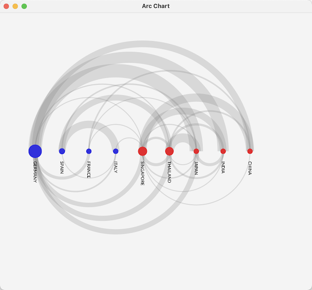
In addition one could also create a cluster to group items. For this I've simply created another chart without any meaning just to show the clustering. So in this case the clusters are europe and asia. The items in each cluster are sorted by the sum of their connection values from left to right.
If you have clustered items all connections from the cluster will get the color of the cluster. A cluster will be created as follows:
Cluster europe = new Cluster("Europe", Color.BLUE, germany, france, italy, spain);
Where germany, france, italy and spain are PlotItems that can be created as follows:
PlotItem germany = new PlotItem("GERMANY", 1_250_000, Color.RED);
The connections between the items can be created as follows:
germany.addToOutgoing(india, 150_000);
If you would like to highlight a specific connection you can get it as follows:
arcChart.getConnection(germany, india).setFill(Color.GREEN);
Oh and the new ArcChart is part of the last release of my charts library which you can find at:
So that's it for today...enjoy the upcoming weekend and...keep coding...


No comments:
Post a Comment