Aloha,
last week I was searching the web for some comparison between an older iMac and an older Macbook Pro. And when I was skimming the web for such comparison pages I saw those comparison charts on some of the pages I've found.
Well I just checked "comparison chart" on Google and took a look at the images and found something like this:
And you will find a lot of similar charts on the web. This could be a really useful chart for some use cases and the best of all...it's really easy to implement :)
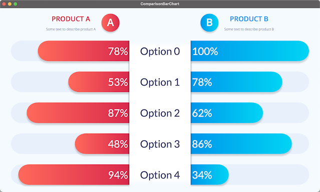
Long story short...here is my version of a ComparisonBarChart...
Just up front...the header with the "Product A" label and the "A" in the circle is NOT part of the chart. Because you not always need this labels I've decided to not add them to the chart itself but leave it to the user to add such things manually. So the chart only contains the bars and the categories.
More or less all of the chart is configurable, so here are just a few points that can be adjusted
- The colors of the background, the bars, the bar background, the text etc.
- The number format incl. no of decimals, percentage, shortened etc.
There are some things you have to keep in mind to make the chart and the comparison work. Because you can only compare options that are available on both things you try to compare, the charts takes 2 ChartItemSeries with identical number of items. Each item needs to have the category property set to a category. You need to use the same categories (at least they should have the same name) for both series and their items.
To create the sample above I first have created a list of categories. Then I've created 2 maps with the categories as key and the chart items as value. This can be done in one loop like this:
for (int i = 0 ; i < 5 ; i++) {
    Category category = new Category("Option " + i);
    categories.add(category);
    optionsProductA.put(category, ChartItemBuilder.create().name("Product A (Option " + i + ")").category(category).value(0).build());
    optionsProductB.put(category, ChartItemBuilder.create().name("Product B (Option " + i + ")").category(category).value(0).build());
}
Now you can create the ChartItemSeries by using it's builder and set the items to the e.g. new ArrayList<>(optionsProductA.values()).
To set the bar color for each series you can set the fill for the series for example to a LinearGradient or to a plain color.
Now you can create the ComparisonBarChart using it's builder as follows
chart = ComparisonBarChartBuilder.create(series1, series2)
                                 .prefSize(600, 300)
                                 .backgroundFill(Color.rgb(244, 250, 255))
                                 .categoryBackgroundFill(new LinearGradient(0, 0, 0, 1, true, CycleMethod.NO_CYCLE,
                                                                            new Stop(0.0, Color.rgb(244, 250, 255)),
                                                                            new Stop(0.05, Color.WHITE),
                                                                            new Stop(0.95, Color.WHITE),
                                                                            new Stop(1.0, Color.rgb(244, 250, 255))))
                                 .barBackgroundFill(Color.rgb(232, 240, 252))
                                 .barBackgroundVisible(true)
                                 .shadowsVisible(true)
                                 .textFill(Color.WHITE)
                                 .categoryTextFill(Color.rgb(64, 66, 100))
                                 .shortenNumbers(false)
                                 .sorted(false)
                                 .order(Order.DESCENDING)
                                 .numberFormat(NumberFormat.PERCENTAGE)
                                 .doCompare(false)
                                 .categorySumVisible(false)
                                 .betterColor(Color.BLUE)
                                 .poorerColor(Color.RED)
                                 .build();
To create the chart above you don't need to set all the options that you see in the code above. I've simply added it to show that they are available. For example .doCompare(false), .sorted(false), .categorySumVisible(false), .order(Order.DESCENDING) etc. are all not needed in this case.
If you only would like to compare two feature sets than this is all you need but if you would like to do more...well you can :)
You can for example sort the bars either ascending or descending by the sum of each category items. Meaning to say order it by the sum of the left and the right bar value of each category. This sum can also be shown by setting categorySumVisible to true.
If you set doCompare to true the color of the bars will change so that the one with the higher value (which is always be the "better" value in this chart) get's a different color than the bar with the smaller value (which always is the "poorer" value in this chart). There are some default colors like green for better and orange for poorer but these colors can also be set.
In addition you can also switch some visual effects on by setting shadowsVisible = true. This will add a shadow to each bar and also to the category area (the rectangle in the center of the chart).
If you don't really want to set all colors manually you will find 2 convenience methods for setting the bar colors which are setBetterColor() and setPoorerColor().
When calling these methods the poorerDarkerColor, poorerBrighterColor, betterDarkerColor and betterBrighterColor will automatically be set.
If you don't want to see a gradient for the bar fill you simply have to set the brighter and darker colors to the same values.
The easiest way to figure out how it works is to take a look at the ComparisonBarChartTest class.
This class contains the code for the screenshot above and should be starting point for your own version of the chart.
You will find this new ComparisonBarChart in the jdk17 branch of my JavaFX charts libray on github.
And of course it is also available on Maven Central...but keep in mind...you need to use JDK17 to run it...
That's it for today...so keep coding...


No comments:
Post a Comment