Hi there, back from Devoxx (which was some kind of a brain booster) i got a lot of new ideas...unfortunately i do not have the time to realize them all but a have a loooong list.
During Devoxx i met Jan Goyvaerts who gave me some really useful feedback to the steelseries project. Right at the conference i started working on his ideas and yesterday i released the next revision of the steelseries library.
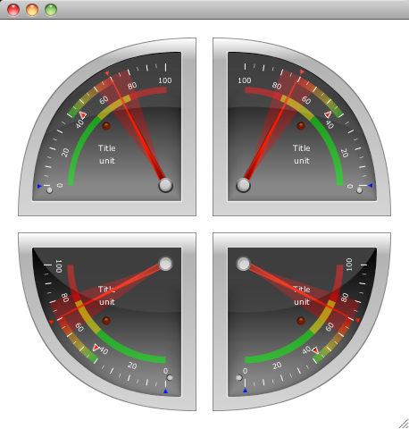
The biggest new thing is a modified version of the Radial1Square component which represents a quarter of a circle. The default quarter was the upper left part of a circle and the request was to support all four quarters of a circle.
Well that gave me a hard time because this component was always a little bit special. First of all i adjusted the size of the component because i was not at the same size as the Radial components (e.g. if the widht of the component was 200px, it used only around 190px of the area). The new version really uses the complete width and height of the component.
That was the easy part (thanx to the FXG converter).
The hard part was creating the other three quarters from the existing component. To achieve this, had to modify a lot of the internal methods because i suddenly needed the possibility to count the tickmark labels in counter clockwise direction, and also the area, the sections and the track needed some modifications.
Well the track was tough because the conical gradient paint was designed to work clockwise and not counter clockwise. After i tried to modify the conical gradient paint in the right way i canceled this approach and implemented a different solution which was much easier to realize.
Now the three colored track will be drawn by a series of lines that will get the right color for it's position and so all of the lines together will result in a gradient.
I also did some internal refactoring where i deprecated some methods and classes that won't be used in future releases anylonger.
The ColorDef class was extended so that it now supports not only DARK, MEDIUM and LIGHT versions of each color but VERY_DARK, DARK, MEDIUM, LIGHT, LIGHTER and VERY_LIGHT versions.
With this modification i was able to get rid of the PointerColor class and i'm also thinking about using the new colors in the LedColor class.
So here is a screenshot of the Radial1Square component with all of it's variations...
I also added icons and BeanInfo classes to all components which should it make easier to choose the right component in the ui editor of your choice.
For example i took a screenshot in JFormDesigner that i use as a plugin in InteliJ Idea...
I hope this will make things easier in the future and i'm looking forward to your feedback.
Currently i'm working on a mavenized version of the steelseries library which seems to be better for one or the other...
That's it for today, keep coding...
Thursday, November 25, 2010
Thursday, November 18, 2010
Contour Gradient Paint
Sorry, no new component this time but another little class that might be of help for you.
When i created the ConicalGradientPaint some time ago i knew that there's one more gradientpaint that is not in the java2d api. The so called ContourGradient or it's special form the DiamondGradient.
This kind of gradient is not used as often as the Linear- or RadialGradient but nevertheless it could be really useful.
To give you an idea of what i'm talking about here let me show you some images that explains the gradients...
Right now my implementation only supports rectangular shapes which means i use the boundary of a given shape and fill it with the gradient. That also means it is not a real contour gradient paint because it won't work with a contour of a polygon.
A polygon filled with the ContourGradientPaint will look like this...
As you can see it uses the rectangular boundary of the star shape and fill it with the gradient.
To create a custom gradientpaint you have to understand how the gradients realized in java2d. So let me try to explain...
Say we would like to create a contour gradient that looks like this...
As you can see we have a gradient from red to yellow which is defined by half of the height of the rectangle. And if you take a closer look you will figure out the following structure in the filled box.
You can see four sections and each of this section is filled by a linear gradient from red to yellow. Only the direction of the gradient changes. And because the gradient is defined by half the size of the height, every gradient has the same parameters which means fractions and related colors.
The part in the gradient creation where the magic happens is the getRaster() method. In this method you will get a X and Y coordinate and a TILE_WIDTH and TILE_HEIGHT.
This means your structure will be rastered in tiles of the given TILE_WIDTH TILE_HEIGHT and with every call of getRaster() the position of the tile will be stored in X and Y.
I have tried to create a little image that visualizes the procedure...
In my approach i created a lookup table for the colors and use the GeneralPath in java.awt.geom package to create the four sections.
When iterating over all the pixels in each tile i check for each pixel in which sector he's placed by calling the contains() method of the related sector general path object.
Now you just have to calculate the position in the color lookup table from the position in the current sector (for SECTOR_A and SECTOR_C we'll take the current x position and for SECTOR_B and SECTOR_D we'll take the current y position).
The last step is storing the values for red, green, blue and alpha for each pixel in the data array that will be used to fill the shape.
The ContourGradientPaint has the following signature:
This is very similar to the inbuild gradient paints and should be easy for you to use.
To realize the box we used above as our example we need the following code:
and here is the result...
You might think "Well...nice but what should i do with this kind of graphic...???"...
To give you an idea i created another example that maybe will open a door to your imagination...
So...now it's up to you...
If you like it, please find the source and the binary here:
Source: ContourGradientPaint_Source.zip
Binary: ContourGradientPaint.jar
That's it for today and now i'll enjoy the best conference i know...Devoxx...
When i created the ConicalGradientPaint some time ago i knew that there's one more gradientpaint that is not in the java2d api. The so called ContourGradient or it's special form the DiamondGradient.
This kind of gradient is not used as often as the Linear- or RadialGradient but nevertheless it could be really useful.
To give you an idea of what i'm talking about here let me show you some images that explains the gradients...
![]() |
| ContourGradientPaint horizontal |
![]() |
| ContourGradientPaint vertical |
![]() |
| ContourGradientPaint square (diamond) |
Right now my implementation only supports rectangular shapes which means i use the boundary of a given shape and fill it with the gradient. That also means it is not a real contour gradient paint because it won't work with a contour of a polygon.
A polygon filled with the ContourGradientPaint will look like this...
![]() |
| ContourGradient on a polygon |
To create a custom gradientpaint you have to understand how the gradients realized in java2d. So let me try to explain...
Say we would like to create a contour gradient that looks like this...
As you can see we have a gradient from red to yellow which is defined by half of the height of the rectangle. And if you take a closer look you will figure out the following structure in the filled box.
You can see four sections and each of this section is filled by a linear gradient from red to yellow. Only the direction of the gradient changes. And because the gradient is defined by half the size of the height, every gradient has the same parameters which means fractions and related colors.
The part in the gradient creation where the magic happens is the getRaster() method. In this method you will get a X and Y coordinate and a TILE_WIDTH and TILE_HEIGHT.
This means your structure will be rastered in tiles of the given TILE_WIDTH TILE_HEIGHT and with every call of getRaster() the position of the tile will be stored in X and Y.
I have tried to create a little image that visualizes the procedure...
In my approach i created a lookup table for the colors and use the GeneralPath in java.awt.geom package to create the four sections.
When iterating over all the pixels in each tile i check for each pixel in which sector he's placed by calling the contains() method of the related sector general path object.
Now you just have to calculate the position in the color lookup table from the position in the current sector (for SECTOR_A and SECTOR_C we'll take the current x position and for SECTOR_B and SECTOR_D we'll take the current y position).
The last step is storing the values for red, green, blue and alpha for each pixel in the data array that will be used to fill the shape.
The ContourGradientPaint has the following signature:
ContourGradientPaint(
Rectangle2D boundary,
float[] fractions,
Color[] colors)
Rectangle2D boundary,
float[] fractions,
Color[] colors)
This is very similar to the inbuild gradient paints and should be easy for you to use.
To realize the box we used above as our example we need the following code:
Graphics2D g2 = (Graphics2D) g;
Rectangle2D box = new Rectangle2D.Double(0, 0, 500, 250);
float[] fractions = { 0.0f, 1.0f };
Color[] colors = { Color.RED, Color.YELLOW };
ContourGradientPaint cgp =
new ContourGradientPaint(box.getBounds(), fractions, colors);
g2.setPaint(cgp);
g2.fill(box);
and here is the result...
You might think "Well...nice but what should i do with this kind of graphic...???"...
To give you an idea i created another example that maybe will open a door to your imagination...
So...now it's up to you...
If you like it, please find the source and the binary here:
Source: ContourGradientPaint_Source.zip
Binary: ContourGradientPaint.jar
That's it for today and now i'll enjoy the best conference i know...Devoxx...
Labels:
swing
Friday, November 12, 2010
Friday Fun Component IV
Thank god it's friday...which means it's time for some fun...
I guess this will be the last friday fun component for the near future because next week i'll be at Devoxx conference in Antwerp (Belgium) from wednesday to friday and it seems that i'll have to travel a bit in the weeks after the conference.
The idea for today's fun component came to me when i was playing around with my Android phone and used the countdown app.
Well on the iPhone there's a very similar looking application which does the same job...simply counting down seconds.
To those of you that do not own one of these phones here are some images...
The counter itself was not very special but this rotating wheels that represents the seconds and minutes is what i like. The idea was born to create a component that is able to give me the impression of a rotating bar with numbers on it.
And that's the result (which to be honest looks like a mixture of both)...
I decided to use only numbers from 0-9 for a bar instead of using numbers from 0-59. This makes the component for me more flexible to use.
You might want to change the max. number of a bar to 5 to realize timers that count for example from 00 sec to 59 sec. Therefor you could set the max number of a bar to values from 3 (which results in 0, 1, 2) to 10 (which results in 0,1,...9). You could of course scale the component to the size you need.
There is also a property named theme which could be changed between BRIGHT, DARK and CUSTOM. If it is CUSTOM you could set the backgroundColor property to a color of your choice. The foreground color (the color of the numbers) will be adjusted by the luminance of the background color. If the luminance is <128 it will be set to white otherwise to black. The component will fire a property change event everytime it passes the 0. There is one event for decrement named "dec" and one for increment named "inc".
In addition you could also adjust the so called switchtime (the time it takes to switch from one number to the next/previous).
Keep in mind that you do not call increment faster than your current switchtime, otherwise it will lead to jumping numbers...
The default switchtime is set to 500ms which is enough to realize a counter.
To give you a impression what you could do with this component i created a timer/countdown component.
This really was a quick hack and should only give you a idea of what is possible...
It looks like this...
One could set the start values for each bar by pressing the appropriate arrow button. Now one could either start the timer (the upper button with the green area) or the countdown timer (the lower button with the red area) and the timer will count from the start values up or down.
If the timer is counting down it will stop counting when reaches 000000 and it will fire a propertychange event named "alarm".
Again i used images that i move around using the trident animation library
Let me try to explain how i realized the behaviour of the component...
I tried different approaches and figured out that the best solution for this kind of component it was to create two images that contain all the available numbers. So for a bar that should count from 0 to 5 one image will look like this...
To create the pseudo 3d effect we need another image that contains a gradient from black to transparent and back to black and put it as a overlay above this digit stack. Here's another image to make it easier to understand...
Because it should be able to count endless we do need two of these digit stack images and move them both. I used the following image to create the counter and get a better visual impression of how the algorithm should work...
0 and 1 represent a digit stack image and the black box in the center represents the visible area of the component. You could see in the image that i have to move each image ontop of each other if it reaches the "invisible" area. The inner black bordered box represents some kind of a switch area, where the component will fire a event (increment or decrement).
But enough with the theory...here is something to play with
So if you like it, please find the source and the binary here:
Source: RollingCounter_Source.zip
Source: RollingCounterDemo_Source.zip
Binary: RollingCounter.jar
Well to be honest i'm not completly satisfied with the counter component and i'm pretty sure that i'll make some modifications to it in the future but who cares...take it or leave it... ;-)
That's it for today and if you are also at Devoxx next week and would like to talk...contact me via twitter...
I guess this will be the last friday fun component for the near future because next week i'll be at Devoxx conference in Antwerp (Belgium) from wednesday to friday and it seems that i'll have to travel a bit in the weeks after the conference.
The idea for today's fun component came to me when i was playing around with my Android phone and used the countdown app.
Well on the iPhone there's a very similar looking application which does the same job...simply counting down seconds.
To those of you that do not own one of these phones here are some images...
And that's the result (which to be honest looks like a mixture of both)...
I decided to use only numbers from 0-9 for a bar instead of using numbers from 0-59. This makes the component for me more flexible to use.
You might want to change the max. number of a bar to 5 to realize timers that count for example from 00 sec to 59 sec. Therefor you could set the max number of a bar to values from 3 (which results in 0, 1, 2) to 10 (which results in 0,1,...9). You could of course scale the component to the size you need.
There is also a property named theme which could be changed between BRIGHT, DARK and CUSTOM. If it is CUSTOM you could set the backgroundColor property to a color of your choice. The foreground color (the color of the numbers) will be adjusted by the luminance of the background color. If the luminance is <128 it will be set to white otherwise to black. The component will fire a property change event everytime it passes the 0. There is one event for decrement named "dec" and one for increment named "inc".
In addition you could also adjust the so called switchtime (the time it takes to switch from one number to the next/previous).
Keep in mind that you do not call increment faster than your current switchtime, otherwise it will lead to jumping numbers...
The default switchtime is set to 500ms which is enough to realize a counter.
To give you a impression what you could do with this component i created a timer/countdown component.
This really was a quick hack and should only give you a idea of what is possible...
It looks like this...
One could set the start values for each bar by pressing the appropriate arrow button. Now one could either start the timer (the upper button with the green area) or the countdown timer (the lower button with the red area) and the timer will count from the start values up or down.
If the timer is counting down it will stop counting when reaches 000000 and it will fire a propertychange event named "alarm".
Again i used images that i move around using the trident animation library
Let me try to explain how i realized the behaviour of the component...
I tried different approaches and figured out that the best solution for this kind of component it was to create two images that contain all the available numbers. So for a bar that should count from 0 to 5 one image will look like this...
To create the pseudo 3d effect we need another image that contains a gradient from black to transparent and back to black and put it as a overlay above this digit stack. Here's another image to make it easier to understand...
Because it should be able to count endless we do need two of these digit stack images and move them both. I used the following image to create the counter and get a better visual impression of how the algorithm should work...
0 and 1 represent a digit stack image and the black box in the center represents the visible area of the component. You could see in the image that i have to move each image ontop of each other if it reaches the "invisible" area. The inner black bordered box represents some kind of a switch area, where the component will fire a event (increment or decrement).
But enough with the theory...here is something to play with
So if you like it, please find the source and the binary here:
Source: RollingCounter_Source.zip
Source: RollingCounterDemo_Source.zip
Binary: RollingCounter.jar
Well to be honest i'm not completly satisfied with the counter component and i'm pretty sure that i'll make some modifications to it in the future but who cares...take it or leave it... ;-)
That's it for today and if you are also at Devoxx next week and would like to talk...contact me via twitter...
Friday, November 5, 2010
Friday Fun Component III
Which doesn't mean that it wasn't fun...
Every morning when i switch on my magic mouse i see this little switch on the back of the magic mouse. The button is small, it shows it's state in a clean understandable way and it doesn't need some led to visualize it, just a simple green colored background if the mouse is switched on...perfect.
For those of you that don't know what i'm talking about...here it is...
I liked it so much that i decided to create a little swing component that looks like that (or similar to that)...
And here we go...
![]() |
![]() |
| CHECKBOX.setRised(false); (standard) |
![]() |
| CHECKBOX.setRised(true); |
So the rised property only changes the look of the colored area so that it looked "sunken" as the default and "rised" if you set rised to true;
You will find all the colors i defined in the SteelSeries lib also here in the component but if you like you could add your own colors by editing the values in the eu.hansolo.tools.ColorDef class.
Here is a little screenshot of all the available colors in "sunk" and "rise" state:
These colors are only visible if you set the colored property to true, otherwise the selected state will always look like the gray version with rised == true.
So if you like it, please find the source and the binary here:
Source: SteelCheckBox_Source.zip
Binary: SteelCheckBox.jar
That's it for today...enjoy the upcoming weekend...
Subscribe to:
Comments (Atom)


