Showing posts with label gauge. Show all posts

Thursday, June 8, 2017

Another new TilesFX skin...

Aloha,

Last time when I was sitting in Singapore skimming the web for some interesting stuff I've stumbled upon a dashboard where a gauge was in front of a line graph. Unfortunately I did not save the image but it was stuck in my head and I thought it might sometime be useful to see not only the current value but also a little history of formerly measured values.
Here is a little screenshot of what I came up with...


As you can see the control shows a bar graph gauge which visualizes the current value. In the center of this gauge you will find a line graph that shows the history of the measured values. In this case I've made use of the strokeWithGradient() feature in combination with gradientStops() to color the line graph.
The time in the lower right corner shows the time of the last update and the text in the lower center shows the time from the first measurement in the line graph to the last measurement.
I think I should also add min- and maxValue to the gauge to get a better idea about the possible range but that's not done yet.
I can imagine that this kind of visualization might be interesting for some use cases but to be honest I'm not sure :)

The new skin can be found in the latest release of TilesFX (1.4.3) which you can find here

Source: github

Binary: bintray

The name of the skin is: SkinType.GAUGE_SPARK_LINE

The screenshot above was create using the following TileBuilder code:

tile = TileBuilder.create().skinType(SkinType.GAUGE_SPARK_LINE)
                  .prefSize(400, 400)
                  .minValue(0)
                  .maxValue(100)
                  .title("Data")
                  .text("Test")
                  .textVisible(false)
                  .averagingPeriod(25)
                  .autoReferenceValue(true)
                  .tooltipText("")
                  .barColor(Tile.YELLOW_ORANGE)
                  .barBackgroundColor(Color.rgb(255, 255, 255, 0.1))
                  .sections(new Section(0, 33, Tile.LIGHT_GREEN),
                            new Section(33, 67, Tile.YELLOW),
                            new Section(67, 100, Tile.LIGHT_RED))
                  .sectionsVisible(true)
                  .highlightSections(true)
                  .animated(true)
                  .strokeWithGradient(true)
                  .gradientStops(new Stop(0.0, Tile.LIGHT_GREEN),
                                 new Stop(0.33, Tile.LIGHT_GREEN),
                                 new Stop(0.33,Tile.YELLOW),
                                 new Stop(0.67, Tile.YELLOW),
                                 new Stop(0.67, Tile.LIGHT_RED),
                                 new Stop(1.0, Tile.LIGHT_RED))
                  .build();

And that's it for today, short but hopefully useful :)

Keep coding...

Thursday, January 19, 2017

Customize your dashboard

Aloha,

This is just a short post about the TilesFX library (github, bintray, maven) in combination with other libraries like 


The TilesFX standard tiles are nice and might be good for most of the typical dashboard content but what if you need more than that?
Let's say you would like to see a listview or one of your custom controls on such tile...
Well for that reason I've added the CustomTileSkin which has the title and the text property of the standard tiles and which comes with an area where you can put your own JavaFX nodes.
So this is what it looks like...


As you can see the area for custom JavaFX nodes fills most of the tile so that you should have enough space for your components. If you setTextVisible(false) the area will even grow a bit more in y-direction.
To give you an idea on how to use other controls within TilesFX I've created a little demo project which you can find on github at

https://github.com/HanSolo/tilesfxdemo

If you would like to start the demo from the command line you simple can call gradle Demo on the shell as follows:


This will start the Main class of the project and will show you the following screen...


In this demo you will see nearly all of the standard tiles in TilesFX (except the WeatherTileSkin) and in addition there is also one tile that simply uses an icon from the Ikonli library, nine tiles that shows some gauges from my Medusa library and three regulators from my Regulators library.

The Tile class in TilesFX defines some colors that fit nicely to the standard tiles, so you can choose between GRAY, RED, GREEN, BLUE, ORANGE, YELLOW_ORANGE, YELLOW and MAGENTA. In addition also the standard FOREGROUND and BACKGROUND color are available in the Tile class. As you can see in the image above I made use of the Tile.BLUE color for all the Medusa gauges.

I hope this demo will help you to make use of TilesFX for your own dashboards.

That's it for today...so keep coding... :)

Tuesday, December 6, 2016

Medusa Sparkline Skin

Aloha,

While working on the gauges for our customer I figured out that with the given feature set in Medusa it would also be possible to create a skin that is similar to so called Sparklines.
The idea is to store a given number of values in an internal list and just show them in a little line graph, e.g. the last 10 measured values.
In addition the moving average of the visualized data will be shown and the standard deviation of the data.
It just tooks me a couple of hours last Monday night to get it done and I hope it will be somehow useful.
Here is a little screenshot of the new skin...


It has the following features

  • Title
  • Current Value
  • Unit
  • min value (of shown data)
  • max value (of shown data)
  • moving average (of shown data)
  • standard deviation (of shown data)

The term "shown data" means that for example the minimum value is not the absolut ever measured minimum but only the minimum of the visible data in the line graph.
If you need the absolut measured minimum you can ask the gauge for the getMinMeasuredValue() and/or getMaxMeasuredValue(). 
The number of datapoints that will show up in the line graph can be configured by calling the setAveragingPeriod(Integer) method (the default is 10).
The color of the line can be set by using setBarColor(Color).

This skin is part of the current Medusa release which is already 6.5 and you can find it here


That's it for today...so keep coding :)

Wednesday, November 30, 2016

Medusa KPI Skins

At the current project I'm working on a JavaFX dashboard using gauges...which is awesome :)
And so I was looking for interesting designs that might be useful for a dashboard visualizing KPI's (Key Performance Indicators). So I stumbled upon two interesting designs that might be a good fit for a grid or tile based dashboard layout.
So here they are...


The TileTextKpiSkin on the left side shows the current value by the text, a bar, the maximum value it could reach (here 100) and the value in percentage.
The TileKpiSkin on the right side shows the current value by it's number, a defined threshold (75) and a needle that shows where the current value is in the given range.
Both tiles also show a title on the upper left corner.
Well...it's nothing special but didn't take long to implement it so why not :)

Both skins are part of the latest Medusa version (6.3) which you can find here


*** UPDATE ***
After playing around with the new skins I came to the conclusion that it would also make sense to have the ability to visualize sections. So I've added them to both skins and they will be available with the next version (6.4) of Medusa.
Here is a little screenshot of how they will look like...


So as soon as you have sections enabled the threshold won't be shown on the left skin (TileKpiSkin) but only the active section.
On the right right skin (TileTextKpiSkin) the bar and the percentage text will either be colored with the default value (barColor) or with the color of the active section. I've also added the unit text for the right skin.

That's it for today...so keep coding... 

Friday, November 18, 2016

Medusa Industrial Clock Skin

And another one...
Yesterday I was in Stuttgart and on my way back one of my train connections was canceled. This gave me another hour of coding in the Starbucks at the Cologne train station. I mean coffee and code...what could be more productive ;)
So I was searching the picture app on my mac and stumbled upon a clock that I would like to implement for a long time, to be honest it have been two clocks but take a look yourself, here they are...


As you can see it is the same watch face just in two different colors. This clock looks similar to one of the Apple Watch watch faces and so I decided to create a new clock skin for Medusa.
Here is my implementation in Medusa...


The only thing that's missing is the glossy overlay but that can be added later by yourself. The new skin is named IndustrialClockSkin and will be available in the upcoming release 6.3 of Medusa.

To create the dark version of the clock you need to create it like follows...

clock = ClockBuilder.create()
                    .skinType(ClockSkinType.INDUSTRIAL)
                    .prefSize(400, 400)
                    .locale(Locale.GERMANY)
                    .shadowsEnabled(true)                    
                    .running(true)
                    .backgroundPaint(Color.web("#1f1e23"))
                    .hourColor(Color.web("#dad9db"))
                    .minuteColor(Color.web("#dad9db"))
                    .secondColor(Color.web("#d1222b"))
                    .hourTickMarkColor(Color.web("#9f9fa1"))
                    .minuteTickMarkColor(Color.web("#9f9fa1"))
                    .build();

For those of you that would like to use before...just grab the code from github...

That's it for today, enjoy the upcoming weekend and...keep coding ;)

Friday, July 29, 2016

Friday Fun XXXV

Hi there,

Well I could not withstand to create another Friday Fun control before my vacation which is another little gauge that might be useful for one or the other dashboard.
Last weekend I saw a similar gauge on a tweet and thought by myself that should be an easy one...so here is the gauge from the tweet...


...and what should I say...it was easy :)

Here is a little screenshot of my version...


This is not really something special but I think it might be useful. So on the outside you see what I call sections (green, yellow and red) and the bar that represents the current value of the gauge will always be drawn in the color of the current section.
If you switch off the visibility of the sections (setSectionsVisible(false)) the sections will disappear and the bar will be drawn in the barColor.
You could add the sections by calling the setSections(Section... sections) method or add single sections by calling the addSection(Section section) method.

And if you would like to see it in action, here is a little video..


As I said nothing special but if you are interested in the code you can find it on github as always.

That's it for today, so enjoy the summer and keep coding...

Friday, July 22, 2016

Friday Fun XXXIV

Aloha,

This is the last Friday Fun component before my vacation so I hope you like it :)
Tuesday I was skimming the web to get some inspiration and stumbled upon a nice little gauge at Dribbble. This is what it looks like...


The use case for such a control is really specific but I like how the designer did it and so I thought this might be an interesting control to create.
With most of the the controls I make again use of my Medusa library for the gauge model. The control itself is based on a JavaFX Region which is the easiest way to create custom controls. You just have to keep in mind that this approach is not very convenient when creating controls libraries because there is no separation of the model and the view.
For the colored areas I used the Medusa Sections and for the visualization of those sections I simply used JavaFX Path's.
The current quality indicator is just another path that will be translated, rotated and filled by the current section color.
To give you an idea how I create such controls let me show you the prototype that I created in an vector drawing prototype.


From this drawing I took all the parameters that I needed to create the control. And this is what the control looks like...


I'm not using the exact same colors as the original but I think it's close enough :)
For those of you who want to see it in action, here is a little video that shows the functionality...


This fits well where you have values that are good when they are small but not the way around which is the reason why I've added a property named reverseOrder which can be used to reverse the color scheme. Means if reverseOrder == true the colors will be from red (1) to green (10).

And that's all I have to say for today...and for at least the next 3 weeks because I will be on vacation...on Crete...yeah :)

If you would like to take a look at the code, feel free to fork it on github.

Enjoy the upcoming weekend and keep coding...

Friday, July 8, 2016

Friday Fun XXXIII

Aloha,

Today I just have a little control that I want to share with you, it's not really something special but sometimes could be useful, I named it ChargeControl. It could be used to visualize the charge of a battery, signal strength or goal reached etc.
The really nice thing about this control is that I wrote it in 30 minutes which simply shows how effective it can be to use JavaFX (if you know what you are doing ;) ).
So here is what it looks like...


As you can see it's not really amazing but it works which was the most important thing. Again I make use of Medusa for the model and one can set values from 0.0 - 1.0.
This control is really light-weight because it only contains Regions that are styled by CSS which makes the amount of code to realize it really small.

Well what should I say...I guess that's it already again and if you are interested in the code you will find it as always on github.

Enjoy the upcoming weekend and do never forget...keep coding ;)

Friday, June 3, 2016

Friday Fun XXXI

Friday...finally :)

And again time for another Friday Fun Component...and yes it is a gauge again :)
This time I've stumbled upon a gauge that again has a neat effect which is not that easy to implement. But before I start let's take a look at it, here it is...


To be honest, I don't really like this gauge. There are two things that are really not that nice...

  • You can't see where the bar starts and where it ends
  • It always show this quarter which is filled...seems to be a special design feature


Well but there is also one thing that I really like about this gauge, it's the fact that it uses a gradient to fill the bar.
Seems trivial right...but it's not, you might want to try to fill a doughnut like structure with a gradient and you will see what I mean.
There is no easy way in JavaFX to realize this, except you use my ConicalGradient...one more time :)
But because the ConicalGradient is not really made for dynamic changes the whole thing is not really optimal.
Just for the ones of you that don't know my ConicalGradient, you might want to read my blog post about it here.
The problem with this gradient is the fact that I create it by using the PixelWriter. This will create a new image everytime I need the gradient.

You can image that creating an image pixel by pixel could not be very fast and for that reason I restricted the animation duration to a minimum of 2 seconds for this gauge. And even with this you will see some flicker during the animation.

So please don't use this gauge for real-time data with lots of updates because you will be disappointed. But it's really nice for dashboards where the values normally don't change that often.

But now let's take a look at the result first...


And because it's fun I've add the ability to change the color...what else... :)
So it could also look like follows...


Or whatever color you like. Keep in mind that some colors fit better than others.

So what I do in the control is everytime the value changes I reset the gradient stops for the ConicalGradient and set the stroke of the bar with it. And to fix the problem with the missing start and end point of the original I've decided to simply set the angle range of the gauge to 320 degree instead of 360 degree.
With this approach you can see where the bar starts and where it stops.

To use this control you will need the medusa library version 5.+ that you can either find on github, bintray or maven central.

Well not a long post but better than nothing :)

If you are interested in the code you can find it as always on github.

As a reminder, please ping me if you would like to attend the Java(FX) BBQ :)

Enjoy the upcoming weekend and keep coding...

Friday, May 13, 2016

Friday Fun XXIX

Finally Friday again...and with that comes another Friday Fun Component.
This time I stumbled upon a control that doesn't really look that fancy and to make it short here is a picture of what I am talking about...


This control is used over at orangetheory fitness where you do your workout in a group and the trainer can see the individual data on a monitor like on the image. As you can see the control itself is not really fancy but I liked the colors and it has again a little thing which was not that easy to implement.
I just had this image and I have no idea how the control works in reality so the first thing I did was creating a prototype in Adobe Fireworks which looks like follows...


As you can see I've modified the control a bit because I wanted to see the current zone in the lower right and put the BPM label instead of the other number (I have no idea what it means).
With this vector drawing in place it was easy to create the control in JavaFX but there was one little thing that I was missing. There are these little colored trapezoids on the lower left side of the control and if you take a look at the upper image you will see that in whatever zone I'm at the moment the little trapezoid with the same color as the current background is bigger than the others. And exactly this little feature was the main reason to build this control.
This little trapezoids have no special meaning but they give the control a special touch and so I started thinking about how could they work.
The first idea that came to my mind was they should be animated. Means as soon as the heart rate zone changes the trapezoid with the same color should increase it's size using an animation.
Nice idea but it comes with a problem...
Because the trapezoids are all the same just with different colors I thought it should be easy to just create a path for the small and for the big version and morph them when needed. Unfortunately JavaFX doesn't offer a morphing transition by default BUT Tom Schindl (create of E(fx)clipse and on twitter under @tomsontom) has created an excellent PathMorphTransition which takes a source and a target path and animates the points from the source path to the target path. (you can find the PathMorphAnimation class in the Eclipse source code and also in the sources of this friday fun component).
So I've put the 5 trapezoids in an HBox container and I was ready to go...well not really.
The first problem comes with resizing...because the Path is a Shape it has no setPrefSize() method. Well the workaround is to use setScaleX() and setScaleY() on the Path. But this comes with another problem...placement. The problem is that when you scale a node in JavaFX you have to take care about the placement in a different way to make sure that the scaled node stays at the correct position.
Well even this was not a big deal but there was another problem...
When morphing a trapezoid from the small to the big state the layout bounds of the trapezoid will change because we increase the width and height.
And because I've put the trapezoids in an HBox with a spacing of 0 it leads to the following effect...


When the gray trapezoid will be transformed the increase in width will lead to a bigger gap between the gray and the blue trapezoid...BAM
And because I can't adjust the spacing for each child of the HBox this approach did not work. :(
Well there are ways to realize this but that felt like a workaround which I did not like.
So I was looking for another approach and decided that the easiest way would be to create a separate control for the trapezoid that encapsulates the Path object in a Region.
To make this work you have to make sure that the Region always has the size of the big trapezoid. So I can put the Regions in a HBox and because the Region won't change it's layout bounds when the trapezoids morphs from one to the other state the distance between the trapezoids stays the same.
To make sure that the trapezoids are not too far away from each other I've use a negative spacing (keep in mind that when resizing the control you also have to resize the spacing of the HBox).
Long story short...here is the result of my JavaFX version...


To make the control work you have to initialize it with your age. I need that info to calculate the maximum heart rate for the control. The calculation of the maximum heart rate is based on the following equation which seems to be good enough...

    maxBpm = (207 - 0.7 * (age));

There are other equations but it seems this is more accurate (at least that's what I've found on the web).
If you initialize the control with an empty constructor it takes 30 as the default age.
Now you simply have to call the setBpm() method of the control to set the current heart rate and the control will react on it.
Because your heart can beat faster than the recommended max heart rate there is an indication that you are over 100% by blinking the text.
Means if your heart rate is higher than 100% it will still show 100% but the numbers will start to blink as long as your heart rate is higher than 100%.
Well maybe that was not a really fancy control but again it has a little feature that was interesting to implement.

Here is also a little video that shows the control in action...


If you are interested in the code you will find it as always on github.

That's it for today and even if I don't know if I will ever use this control I hope someone of you have learned something...enjoy the upcoming weekend...and keep coding... :)

Friday, April 29, 2016

Friday Fun XXVIII

And another friday which means time for some fun again...
It's interesting but again I've found a control that looks simple when you see it for the first time but at a second look you will figure out that it's not so easy to implement.
So here it is...


Apart from that the white bar seems to be misaligned in the picture above, the control has a neat effect. First of all the semitransparent white ring in the background makes it possible to put that control on whatever color and because it is translucent the background color will shine through like on the picture above.
In addition it comes with some 3D effect that is produced by the drop shadow of this ring.
Exactly this drop shadow is the thing that looks easy to do but it's not and the reason is the following.
If you create a ring (e.g. using a JavaFX Arc object) you can give it a strokeLineWidth and a Color. Adding a DropShadow is a no-brainer in JavaFX and in principle that's all you have to do. But because the Arc is translucent we will see the DropShadow shine through which will make the Arc appear darker which exactly is the problem.
To give you an idea what I'm talking about, here is a little screenshot of the effect...


As you can see we have a nice DropShadow on the Arc but we also see it shine through the ring which makes it appear dark. If you take a look on the picture above you will see that the ring appears bright and translucent plus the DropShadow...so how to achieve that???
Well the answer is trivial but the solution not... :)
First we need to draw an Arc with a DropShadow that will look as follows...


In the next step we have to create a mask that only contains the shadow without the ring, which we can do by creating two rings. Then we subtract the smaller ring from the bigger one like follows...


On the right side we now have our shape that we can use as a clipping mask which will only contain the DropShadow without the orange ring.
Now we can apply this clipping mask to the Arc that has the DropShadow and it will look similar to this (the white should be transparent)...


And in the last step we can draw the final Arc that will be filled with Color.rgb(255, 255, 255, 0.4) so that the background can shine through.
The code to realize this operation will look as follows...


Arc outerRing = new Arc(size * 0.5, size * 0.5,
                         size * 0.43125, size * 0.43125,
                         0, 360);
outerRing.setFill(null);
outerRing.setStroke(Color.WHITE);
outerRing.setStrokeLineCap(StrokeLineCap.BUTT);
outerRing.setStrokeWidth(size * 0.3);

Arc innerRing = new Arc(size * 0.5, size * 0.5,
                        size * 0.43125, size * 0.43125,
                        0, 360);
innerRing.setFill(null);
innerRing.setStroke(Color.WHITE);
innerRing.setStrokeLineCap(StrokeLineCap.BUTT);
innerRing.setStrokeWidth(size * 0.1375);

Shape shape = Shape.subtract(outerRing, innerRing);

backgroundRing.setCenterX(center);
backgroundRing.setCenterY(center);
backgroundRing.setRadiusX(size * 0.43125);
backgroundRing.setRadiusY(size * 0.43125);
backgroundRing.setStrokeWidth(size * 0.1375);
backgroundRing.setClip(shape);

barBackground.setCenterX(center);
barBackground.setCenterY(center);
barBackground.setRadiusX(size * 0.43125);
barBackground.setRadiusY(size * 0.43125);
barBackground.setStrokeWidth(size * 0.1375);


And we have to do this clipping everytime the size of the control changed. The final result of this operations will then look like follows...


And this is exactly how it should look like :)
For the implementation I make use of the Medusa gauge so there is a dependency on the Medusa project.

If you would like to see the code you will find it on github as always.

That's it for today, so I wish you all a nice weekend and...keep coding...

Friday, February 26, 2016

FridayFun XXIII

Finally Friday again...
I just recognized that it's more than a year ago that I posted a Friday Fun Component...so here you go...

Last Monday I was skimming the web for interesting controls and stumbled upon the following image.


This might be a very handy gauge for some visualizations like health dashboards etc. In principle it would be very easy to realize something like this because it just contains a few visual parts.
The interesting part of that control is the wavy shaped top edge of the inner fill. If you would like to keep it static this is also no big deal BUT...would it not be cooler if the surface will be animated???
I found some code on the web that did something similar and ported it to Java.

Long story short, here is a little video of the control in action...


I've added the code to the medusa demo project that you can find on github (it is called FunLevelGauge).
Instead of using a special Skin for the Medusa Gauge I've simply took a Region and added a Medusa Gauge as member variable.
The code for the Gauge is very simple and looks like this...

Gauge gauge = GaugeBuilder.create()
                          .minValue(0)
                          .maxValue(1)
                          .animated(true)
                          .build();
As you can see this is really nothing special. For the visualization I used a JavaFX Canvas node that I clipped with a simple JavaFX Circle element.
The ring around the control is again a JavaFX Circle that has a transparent fill and a stroke with the same color as the inner part.
The JavaFX Text node in the center of the control changes it's color dependent on the fill level of the control. The color for the text will be derived from the fill color.
If you would like to play around with the waviness of the surface you might want to play around with the following parameters...
  • detail        (no of points used for the wave)
  • friction            
  • density 
In the example I add an impulse to the wave every second to keep the wave moving but you could also think about to add an impulse only when a new level was set like this...
public void setLevel(final double LEVEL) {
    gauge.setValue(LEVEL);
    Point p;
    for( int i = 0 ; i < detail + 1 ; i++ ) {
        p = particles.get(i);
        p.y = size * (1d - LEVEL);
        p.originalY = p.y;
    }
    text.setText(String.format(Locale.US, "%.0f%%", 100 * LEVEL));
    text.setX((size - text.getLayoutBounds().getWidth()) * 0.5);
    text.setFill(LEVEL < 0.45 ? darkerColor : brighterColor);
    impulse();
}
Therefore you just have to add the call the impulse() method to the setLevel() method and remove the following code from the AnimationTimer
if (now > lastImpulseCall + impulseInterval) {
    impulse();
    lastImpulseCall = now;
}


Please keep in mind that this is (like the name says) a Fun Component and that there is always room for improvements but it's good enough to give you some ideas...

And that's it for today, enjoy the upcoming weekend and keep coding...

Wednesday, February 24, 2016

Building a multi gauge with Medusa

Today I will show you how to build what I call a multi gauge, so a gauge that shows more than one single value but for example shows three different values. This comes in handy when you don't have much space to visualize data.

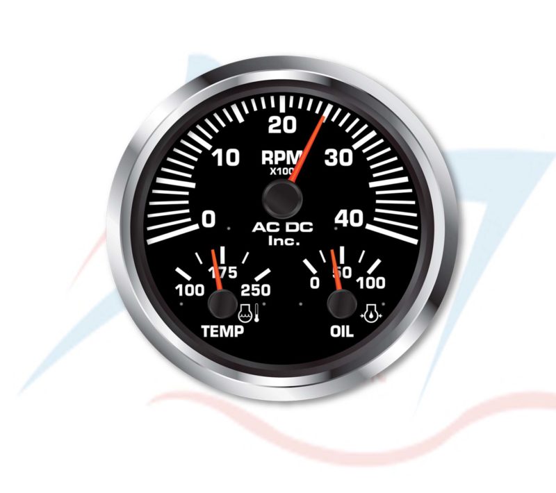
Here is an example of such a gauge
So in this case the RPM is the most important value that you check very often where the temperature and oil are not checked that often which explains the smaller size. To build something similar with Medusa we need to take three Gauge objects.
  • 1x GaugeSkin (RPM)
  • 2x Horizontal Skins (TEMP and OIL)
Overlaying those controls in one area is not a big problem because the standard background fill of the Medusa gauges is transparent, so we simply have to put all three gauges in one layout container.
So the idea is as follows, we create a new class named MultiGauge that extends Region. Therefore I use the following skeleton..

public class MultiGauge extends Region {
    private static final double  PREFERRED_WIDTH  = 250;
    private static final double  PREFERRED_HEIGHT = 250;
    private static final double  MINIMUM_WIDTH    = 50;
    private static final double  MINIMUM_HEIGHT   = 50;
    private static final double  MAXIMUM_WIDTH    = 1024;
    private static final double  MAXIMUM_HEIGHT   = 1024;
    private static       double  aspectRatio;
    private              boolean keepAspect;
    private              double  size;
    private              double  width;
    private              double  height;
    private              Pane    pane;


    // ******************** Constructors **************************************
    public MultiGauge() {
        getStylesheets().add(MultiGauge.class.getResource("styles.css").toExternalForm());
        getStyleClass().add(getClass().getSimpleName().toLowerCase());
        aspectRatio = PREFERRED_HEIGHT / PREFERRED_WIDTH;
        keepAspect  = true;
        init();
        initGraphics();
        registerListeners();
    }


    // ******************** Initialization ************************************
    private void init() {
        if (Double.compare(getPrefWidth(), 0.0) <= 0 || Double.compare(getPrefHeight(), 0.0) <= 0 ||
            Double.compare(getWidth(), 0.0) <= 0 || Double.compare(getHeight(), 0.0) <= 0) {
            if (getPrefWidth() > 0 && getPrefHeight() > 0) {
                setPrefSize(getPrefWidth(), getPrefHeight());
            } else {
                setPrefSize(PREFERRED_WIDTH, PREFERRED_HEIGHT);
            }
        }

        if (Double.compare(getMinWidth(), 0.0) <= 0 || Double.compare(getMinHeight(), 0.0) <= 0) {
            setMinSize(MINIMUM_WIDTH, MINIMUM_HEIGHT);
        }

        if (Double.compare(getMaxWidth(), 0.0) <= 0 || Double.compare(getMaxHeight(), 0.0) <= 0) {
            setMaxSize(MAXIMUM_WIDTH, MAXIMUM_HEIGHT);
        }
    }

    private void initGraphics() {

        pane = new Pane();

        getChildren().setAll(pane);
    }

    private void registerListeners() {
        widthProperty().addListener(o -> resize());
        heightProperty().addListener(o -> resize());
    }


    // ******************** Methods *******************************************
    private void handleControlPropertyChanged(final String PROPERTY) {
        if ("".equals(PROPERTY)) {

        }
    }

    
    // ******************** Resizing ******************************************
    private void resize() {
        width  = getWidth() - getInsets().getLeft() - getInsets().getRight();
        height = getHeight() - getInsets().getTop() - getInsets().getBottom();
        size   = width < height ? width : height;

        if (keepAspect) {
            if (aspectRatio * width > height) {
                width = 1 / (aspectRatio / height);
            } else if (1 / (aspectRatio / height) > width) {
                height = aspectRatio * width;
            }
        }
        
        if (width > 0 && height > 0) {
            // Use for square controls where width == height            pane.setMaxSize(size, size);
            pane.relocate((getWidth() - size) * 0.5, (getHeight() - size) * 0.5);

            // Use for rectangular controls width != height            pane.setMaxSize(width, height);
            pane.relocate((getWidth() - width) * 0.5, (getHeight() - height) * 0.5);
            
        }
    }
}

With this template you could easily compose a new control out of existing controls. So the main work we have to do is to create the three gauges and put them in the right location in the new control.
Let's start with the rpmGauge control. Because I've explained styling a Medusa gauge already in my blogpost "Building a fuel gauge using Medusa" I won't go through all the details but directly give you the code, here it is...

rpmGauge = GaugeBuilder.create()
                       .borderPaint(Color.WHITE)
                       .foregroundBaseColor(Color.WHITE)
                       .prefSize(400, 400)
                       .startAngle(290)
                       .angleRange(220)
                       .minValue(0)
                       .maxValue(4000)
                       .valueVisible(false)
                       .minorTickMarksVisible(false)
                       .majorTickMarkType(TickMarkType.BOX)
                       .mediumTickMarkType(TickMarkType.BOX)
                       .title("RPM\nx100")
                       .needleShape(NeedleShape.ROUND)
                       .needleSize(NeedleSize.THICK)
                       .needleColor(Color.rgb(234, 67, 38))
                       .knobColor(Gauge.DARK_COLOR)
                       .customTickLabelsEnabled(true)
                       .customTickLabelFontSize(40)
                       .customTickLabels("0", "", "10", "", "20", "", "30", "", "40")
                       .animated(true)
                       .build();

We add this code block to the initGraphics() method and we also have to add the rpmGauge as a member variable.
To give you an idea how it would look like, here is a little screenshot...


So the next thing we have to do is adding the temperature and oil gauge. Long story short, here is the code...

tempGauge = GaugeBuilder.create()
                        .skinType(SkinType.HORIZONTAL)
                        .prefSize(170, 170)
                        .autoScale(false)
                        .foregroundBaseColor(Color.WHITE)
                        .title("TEMP")
                        .valueVisible(false)
                        .angleRange(90)
                        .minValue(100)
                        .maxValue(250)
                        .needleShape(NeedleShape.ROUND)
                        .needleSize(NeedleSize.THICK)
                        .needleColor(Color.rgb(234, 67, 38))
                        .minorTickMarksVisible(false)
                        .mediumTickMarksVisible(false)
                        .majorTickMarkType(TickMarkType.BOX)
                        .knobColor(Gauge.DARK_COLOR)
                        .customTickLabelsEnabled(true)
                        .customTickLabelFontSize(36)
                        .customTickLabels("100", "", "", "", "", "", "", "175", "", "", "", "", "", "", "", "250")
                        .animated(true)
                        .build();

oilGauge = GaugeBuilder.create()
                       .skinType(SkinType.HORIZONTAL)
                       .prefSize(170, 170)
                       .foregroundBaseColor(Color.WHITE)
                       .title("OIL")
                       .valueVisible(false)
                       .angleRange(90)
                       .needleShape(NeedleShape.ROUND)
                       .needleSize(NeedleSize.THICK)
                       .needleColor(Color.rgb(234, 67, 38))
                       .minorTickMarksVisible(false)
                       .mediumTickMarksVisible(false)
                       .majorTickMarkType(TickMarkType.BOX)
                       .knobColor(Gauge.DARK_COLOR)
                       .customTickLabelsEnabled(true)
                       .customTickLabelFontSize(36)
                       .customTickLabels("0", "", "", "", "", "50", "", "", "", "", "100")
                       .animated(true)
                       .build();

After adding both gauges to our control it will now look like this...


It's not perfect but also not too bad...and it works :)
The only thing that we now miss is how to resize and relocate the gauges correctly, well that's pretty simple and here is the related code from the resize() method of our MultiGauge control...

private void resize() {
    double width  = getWidth() - getInsets().getLeft() - getInsets().getRight();
    double height = getHeight() - getInsets().getTop() - getInsets().getBottom();
    size          = width < height ? width : height;

    if (size > 0) {
        pane.setMaxSize(size, size);
        pane.relocate((getWidth() - size) * 0.5, (getHeight() - size) * 0.5);

        rpmGauge.setPrefSize(size, size);

        tempGauge.setPrefSize(size * 0.425, size * 0.425);
        tempGauge.relocate(size * 0.1, size * 0.5625);

        oilGauge.setPrefSize(size * 0.425, size * 0.425);
        oilGauge.relocate(size * 0.475, size * 0.5625);
    }
}

As you can see it is really simple to resize and relocate the controls within our MultiGauge control. To get access to the gauges I simply added three get methods for each gauge and that's all it needs :)

You will find the complete example on github.

That's it for today...so keep coding... :)