Aloha from Singapore again, Today I finally managed to create some little Friday Fun components for you, so today I have two new charts for you that are part of my JavaFX charts library. The first chart is a ConcentricRingChart that looks as follows:
Nothing really special but fun. You have a set of ChartItems that you pass to the ConcentricRingChart. The values are always normalized so that the current maximum value fills up to 100%. You can choose between different NumberFormats for the value in the bar and if you click with the mouse on a bar a little popup will show you some information on the clicked item. In addition you can also sort the bars ascending and descending if you like and of course animation is also available. If you would like to see it in action...here you go...
The other chart that I've created is similar which is the reason why I have two components today. This one is a ComparisonRingChart where you can compare two series of ChartItems. The first series will be shown on the upper part and the second series on the lower part. It looks like this...
The upper series goes from left to right where the lower series will be visualized from right to left. Everything else is exactly the same as in the ConcentricRingChart, meaning to say you also have the mouse interaction and the popup. And again if you are interested in how it looks in action...here you are...
As already mentioned both components are part of my little JavaFX charts library that you can found here... Source Code: github Binaries: bintray and Maven Central And that's it for today...cheers from Singapore and keep coding... ;)
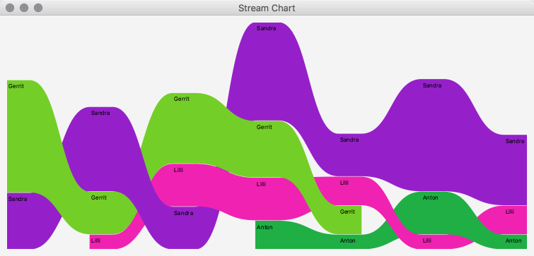
Aloha, Here we go again...last week I stumbled upon a really nice charts that are inspired by Edward Tufte's Stream Charts. This is how they look like...
And here you can find more information about them. The chart can be used to visualize a series of data with the variation of the data it contains over time. On each date different items of the series are stacked like in a stacked bar chart. The items are sorted by their value from bottom to top, meaning to say the items with the lowest value are always at the bottom and the one with the highest values are always on top. To be honest I have again no use case for it but I really like the visualization. By choosing the colors wisely one could visualize dominating series over time very well. Long story short...here is my implementation of such a chart...
As you can see I don't have such good data as in the example above but you get the idea :) To create such a chart I make use of my ChartItem class which has a timestamp property that is needed here to group the chart items for the visualization. The idea is to have a list of ChartItems that may also contain multiple ChartItems from the same day. The StreamChart component has a category property which can be one of the following categories:
DAY
WEEK
MONTH
YEAR
So let's assume you have a list of ChartItems that contains data from different days and you would like to visualize the chart grouped by days you set the category to DAY. With this feature you can define if you would like to group the given list of ChartItems by one of the above categories...hmm...hope that explanation was more or less clear :) It might be easier to simply take a look at the source code (see links below). In principle this chart is similar to the Sankey Plot but not exactly the same so I've started from there and created a modified version which you can see above. This chart is now part of my own JavaFX charts library which you can find here: sources at github binaries at bintray Please find the demo classes for all the charts in the test package. Well that's it for today...so keep coding...
Aloha and a happy new year, Today I just have a short post about some nice little bar chart which I've found last week when looking for new ideas on the web. Here is the image I've stumbled upon...
I saw it and directly understood the idea behind it because it's like a compact view of two bar charts. The big bars in the background show the sum of all inner bars (like in a stacked bar chart) and the inner bars visualize the distribution of that sum into portions. If you want to know how to realize this kind of chart in Excel you should take a look at Jon Peltier's blog where this image was taken from. To be honest the thing that got my attention are the colors he used for this chart because they directly reminded me on the Material Design colors. And because I once implemented these colors in JavaFX I gave it a try. Well I was surprised how easy it was to implement and finished the whole thing within 1.5h and here is a little screenshot of the result...
As you can see this kind of chart works really well with the Material Design colors. So it does not make sense to use it for everything but there might be some use cases where saves a lot of space and still transfers the information. Because I will add this chart to my JavaFX charts library anyway I did not spend more time on implementing axis and labels but I only implemented a mouse event handler. Meaning to say if you click on an element the component will fire an event that contains the data of the selected series (the big bar) and if you've clicked on one of the inner bars it will also contain the data of the selected item. Using this event I've implemented a simple popup that will show the selected data. This kind of chart can for example be used to compare sales data of products per quarter or similar things, you will find something ;) As always the source is available over at github so enjoy playing around with it. That's it for today...I wish you a codeful year 2018...keep coding...