Friday, April 29, 2016

Friday Fun XXVIII

And another friday which means time for some fun again...
It's interesting but again I've found a control that looks simple when you see it for the first time but at a second look you will figure out that it's not so easy to implement.
So here it is...


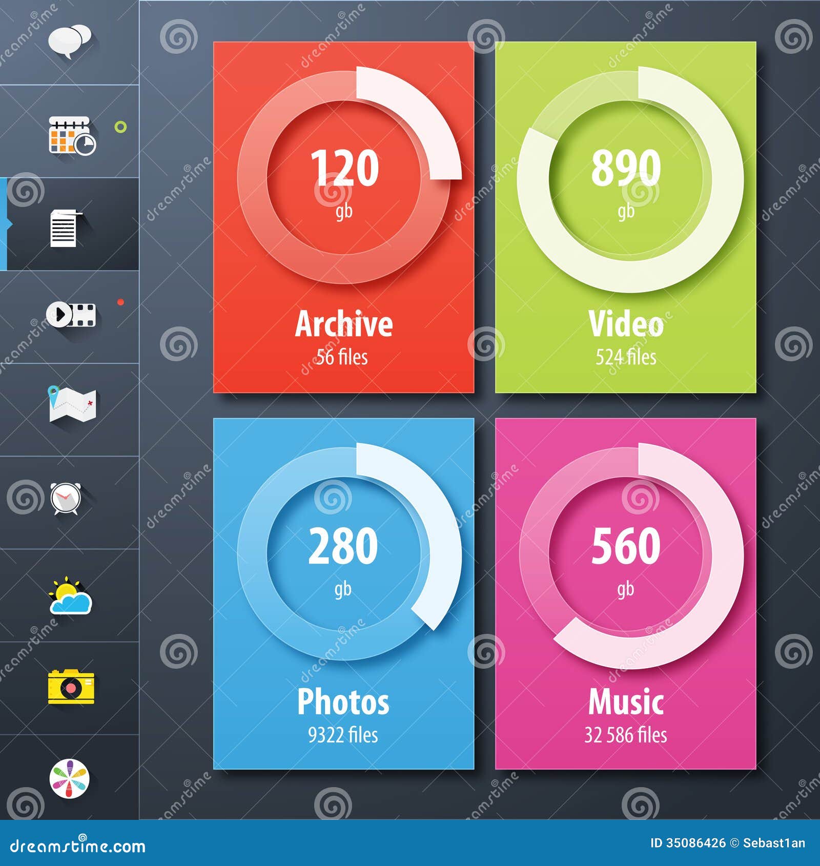
Apart from that the white bar seems to be misaligned in the picture above, the control has a neat effect. First of all the semitransparent white ring in the background makes it possible to put that control on whatever color and because it is translucent the background color will shine through like on the picture above.
In addition it comes with some 3D effect that is produced by the drop shadow of this ring.
Exactly this drop shadow is the thing that looks easy to do but it's not and the reason is the following.
If you create a ring (e.g. using a JavaFX Arc object) you can give it a strokeLineWidth and a Color. Adding a DropShadow is a no-brainer in JavaFX and in principle that's all you have to do. But because the Arc is translucent we will see the DropShadow shine through which will make the Arc appear darker which exactly is the problem.
To give you an idea what I'm talking about, here is a little screenshot of the effect...


As you can see we have a nice DropShadow on the Arc but we also see it shine through the ring which makes it appear dark. If you take a look on the picture above you will see that the ring appears bright and translucent plus the DropShadow...so how to achieve that???
Well the answer is trivial but the solution not... :)
First we need to draw an Arc with a DropShadow that will look as follows...


In the next step we have to create a mask that only contains the shadow without the ring, which we can do by creating two rings. Then we subtract the smaller ring from the bigger one like follows...


On the right side we now have our shape that we can use as a clipping mask which will only contain the DropShadow without the orange ring.
Now we can apply this clipping mask to the Arc that has the DropShadow and it will look similar to this (the white should be transparent)...


And in the last step we can draw the final Arc that will be filled with Color.rgb(255, 255, 255, 0.4) so that the background can shine through.
The code to realize this operation will look as follows...


Arc outerRing = new Arc(size * 0.5, size * 0.5,
                         size * 0.43125, size * 0.43125,
                         0, 360);
outerRing.setFill(null);
outerRing.setStroke(Color.WHITE);
outerRing.setStrokeLineCap(StrokeLineCap.BUTT);
outerRing.setStrokeWidth(size * 0.3);

Arc innerRing = new Arc(size * 0.5, size * 0.5,
                        size * 0.43125, size * 0.43125,
                        0, 360);
innerRing.setFill(null);
innerRing.setStroke(Color.WHITE);
innerRing.setStrokeLineCap(StrokeLineCap.BUTT);
innerRing.setStrokeWidth(size * 0.1375);

Shape shape = Shape.subtract(outerRing, innerRing);

backgroundRing.setCenterX(center);
backgroundRing.setCenterY(center);
backgroundRing.setRadiusX(size * 0.43125);
backgroundRing.setRadiusY(size * 0.43125);
backgroundRing.setStrokeWidth(size * 0.1375);
backgroundRing.setClip(shape);

barBackground.setCenterX(center);
barBackground.setCenterY(center);
barBackground.setRadiusX(size * 0.43125);
barBackground.setRadiusY(size * 0.43125);
barBackground.setStrokeWidth(size * 0.1375);


And we have to do this clipping everytime the size of the control changed. The final result of this operations will then look like follows...


And this is exactly how it should look like :)
For the implementation I make use of the Medusa gauge so there is a dependency on the Medusa project.

If you would like to see the code you will find it on github as always.

That's it for today, so I wish you all a nice weekend and...keep coding...

Friday, April 15, 2016

Friday Fun XXVII

And another friday and again time for some fun...
Well this time the control is small...very small and doesn't have any special features but I needed it and so I thought it might be a good idea to create it.
If you own an Android phone you might know the Material Design Circular Progress Indicator (indeterminate) which looks like this...


Like last weeks friday fun component the problem with this control is not obvious. In principle it's a simple arc where the arcs angle extend accelerates until it gets near to the arcs start, then it decelerates and the arc start angle accelerates. This happens in a combination with a rotation of the whole arc which gives us the nice effect.
I've tried different approaches before I came to the conclusion that an animated dashed arc might be the solution.
To be honest it was a lot of trial and error before I got the parameters right (at least good enough for this control).
After I've found a set of parameters that worked out I realized that the whole thing is dependend on the current size of the control. Means if you increase the size of the circle the dash array needs to be updated otherwise you will suddenly see more than one line moving around. Because it tooks some time to figure out the right parameters for one size I've decided to go with the easy approach...simply scaling the circle instead of really resizing it.
To make sure the circle always stays in the center of the pane I've exchanged the Pane (that I usually use) with a StackPane which does the centering for me. With this approach I'm able to create the circle and resize it properly. The progress indicator will switch to the indeterminate state if the progress is < 0. You can simply call .setProgress(ProgressIndicator.INDETERMINATE) to achieve that. If the progress is between 0 - 1 the circle will be replaced by an arc that shows the current progress. I did not add animation to the standard progress (0 - 1) which could be done by yourself if you like...simply animate the progress between 0 and 1 :)
So here is the result and because it doesn't make sense to show you a screen shot I've recorded a little video...


Another tiny blogpost finished...now enjoy your weekend and if you are interested in the code you can find it on github as always...

sources on github

Oh and don't forget...keep coding... :)

Friday, April 8, 2016

Friday Fun XXVI

And Friday again...finally :)
Today I have another little fun JavaFX component for you which took me some time to build. Those of you that own an Apple Watch (unfortunately I don't have one) might know this control already.
It is the Fitness Gauge that looks like this...


Well in principle this is an easy to do control...BUT...if you take close look the engineers/designers at Apple did again a fantastic job by creating this control. First of all it has a conical gradient on each arc (from a darker to a brighter color). Then it has this neat drop shadow at the end of the arc when it overlaps. 
This seems to be easy to implement but it's not...believe me :)
After some tweaking I got a solution that I'm quite happy with and this is what it looks like...


As you can see it's not really the same but it's not bad :)
You can set each bar individually, the max value for each bar and the color. The control is based on my Medusa library and uses three Medusa Gauges for the data model.

Here is also a little video that gives you an impression how it looks like in action...


So I think that's it for today...just a little fun...enjoy and btw if you need the code...here you go...

Github repository

Keep coding...