Slowly getting into the charting business ;)
After Thomas Nield (@thomasnield9272) pointed me to so called Circular Plots I've couldn't hold back. If you know these charts you might understand why I was so keen on creating such a chart.
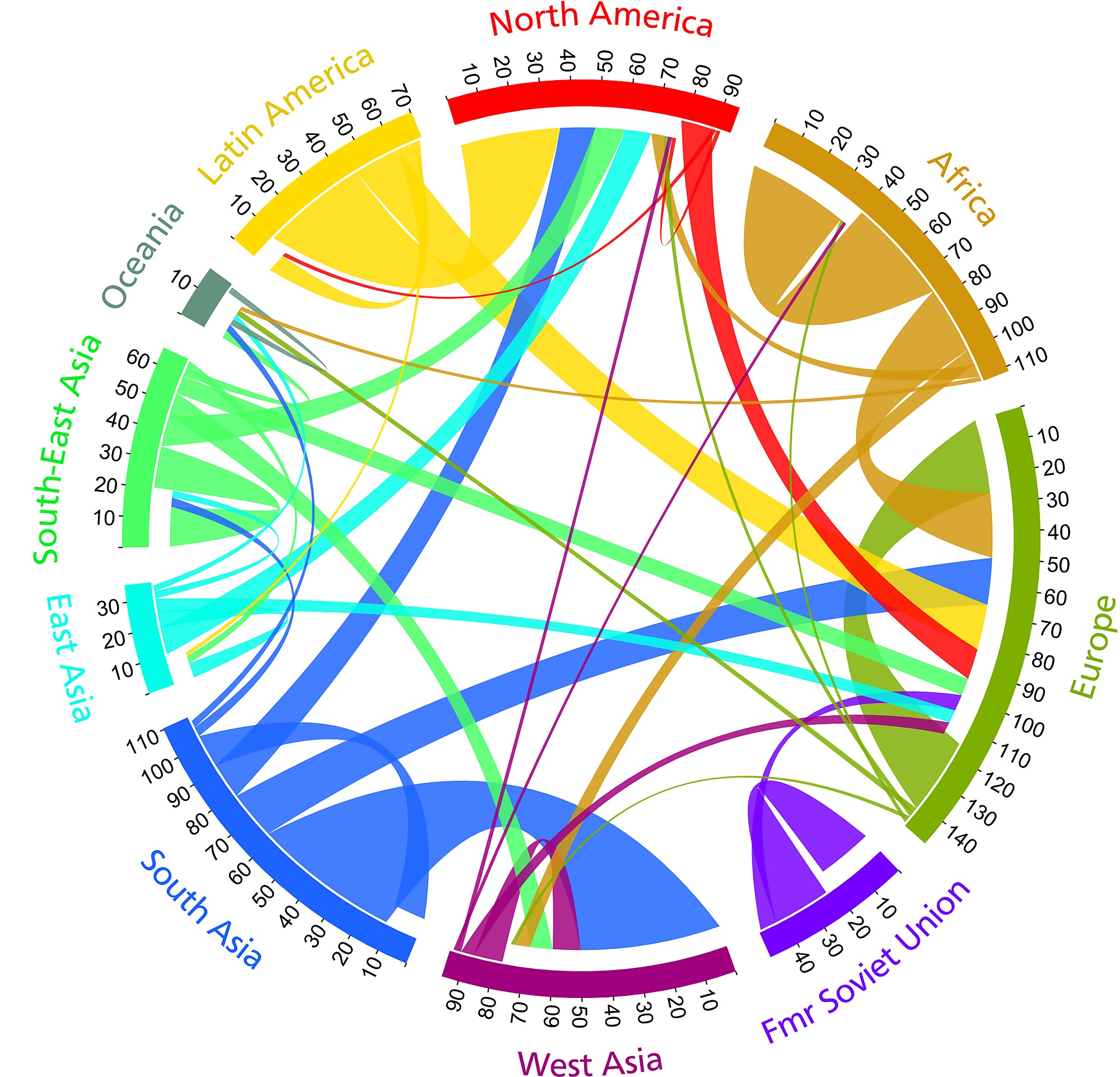
So to give you an example here is an image of such a chart...
To be honest when I first saw the plot I was fascinated even without knowing how to read it and without knowing what this chart is good for. But after I took a look at more and more of those charts I got an idea on how to use them.
So I'm not a data scientist which is the reason why I've implemented it in a way that seemed logical for me.
The biggest problem was to find some data that I could use for the visualization. So in the end I've decided to take the public available data from the current parliamentary election in Germany.
To give you an idea what my chart is visualizing I think I need to explain it a bit. Each section on the chart shows one party with it's name, color and the voting result related to the number of eligible voters (61.5 Million).
Because there was a new party this year it was interesting to see where did the voters came from, so my chart visualizes the migration from all parties to other parties. The bigger the arrow the more voters migrated from the party to another.
So here is my chart...
So in the chart one can see that most of the AfD voters came from the Union party, the so called Non-Voters ("Nichwaehler") and others.
I've also created another chart that shows fictive data about travellers that travel between some asian countries. As always I do not have any use case for this chart and cannot guarantee that it is useful for real data analysis but at least it works for me and was fun to create. So here is the other chart...
At the moment there is not interactivity in this chart but if I will find some time I will definitely add it.
As always you can find the code on github.
That's it for today...enjoy the upcoming weekend and...keep coding ;)


No comments:
Post a Comment