Aloha,
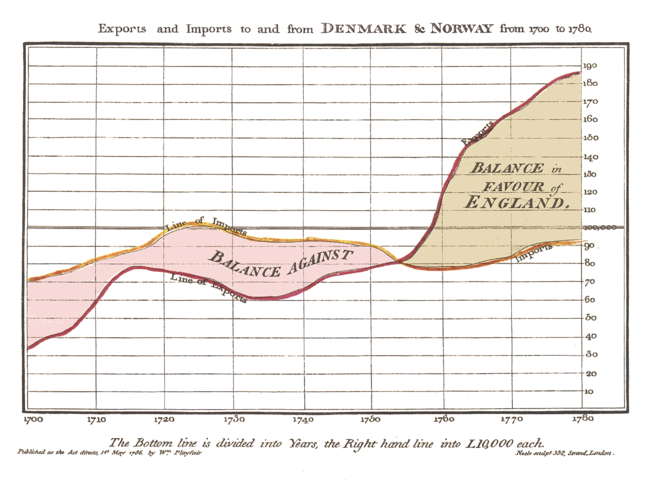
Today I just would like to share a little blogpost about a chart that I've implemented last Friday evening. The chart design is inspired by William Playfair who invented this kind of chart to visualize economic data like import and export of theUS in relation to other countries.
One of his charts looks like follows...
The idea is pretty simple, take two line charts and fill the area between the two charts with a color. The color depends on which line is on top. With this technique one can visualize for example gain and loss of processes etc.
Like mentioned the idea is simple but the realization is not as trivial as it looks. The problem here is that you have two separate line charts that you have to combine to not only one polygon but to multiple polygons.
So every time the two lines cross each other one has to fill the area before the intersection point with one color and the area after the intersection point with the other color.
After thinking about the chart for a bit I've got an idea on how to realize that behavior and here is one result...
As always I do not really have a use case for that chart but I can imagine that it might be useful for someone out there :)
So if you would like to play around with it, feel free to check out the code at github.
I hope to find some time within the next days to add some interactivity to the chart...so stay tuned :)
Well...I guess that's it for today...so keep coding... :)


Gerrit,
ReplyDeleteThank you for your contributions to the Java FX world! I know you don't have a use case for these charts, but my robotics team certainly does. I will keep you updated on our upcoming season, and how we use these charts (and TilesFX) to display our logged data.
https://github.com/iliterobotics/FRC-Robot-2018
Regards,
Jesse